Dev Series – Phoenix Part 4 – UI Improvement using TailwindCSS
Dev Series – Phoenix Part 4 – UI Improvement using TailwindCSS
I’ll pick up where we left off with improving the UI. I’ve been using a lot of Tailwind lately, and since it’s built into Phoenix 1.7, we’ll switch from Bootstrap to Tailwind + Flowbite. Also, since this is a new setup, we’ll replace Flex with the built-in mix phx.gen.auth.
Why TailwindCSS?
TailwindCSS has become the go-to CSS framework for modern web development because:
- Utility-first approach - Build designs directly in your markup
- No CSS bloat - Only the styles you use are included
- Highly customizable - Easy to extend and modify
- Built into Phoenix 1.7 - No additional setup required
- Great developer experience - Excellent IntelliSense support
Setting up TailwindCSS in Phoenix
Since Phoenix 1.7, TailwindCSS comes pre-configured! If you’re upgrading from an older version, here’s how to set it up:
Install TailwindCSS
cd assets
npm install -D tailwindcss @tailwindcss/forms @tailwindcss/typography
npx tailwindcss init
Configure Tailwind
Update your assets/tailwind.config.js:
module.exports = {
  content: [
    "./js/**/*.js",
    "../lib/*_web.ex",
    "../lib/*_web/**/*.*ex"
  ],
  theme: {
    extend: {
      colors: {
        brand: "#FD4F00",
      }
    },
  },
  plugins: [
    require("@tailwindcss/forms"),
    require("@tailwindcss/typography"),
  ]
}
Update CSS
Replace your assets/css/app.css with:
@import "tailwindcss/base";
@import "tailwindcss/components";
@import "tailwindcss/utilities";

/* Custom components */
.btn {
  @apply inline-flex items-center px-4 py-2 border border-transparent text-sm font-medium rounded-md shadow-sm focus:outline-none focus:ring-2 focus:ring-offset-2;
}

.btn-primary {
  @apply text-white bg-blue-600 hover:bg-blue-700 focus:ring-blue-500;
}

.btn-secondary {
  @apply text-gray-700 bg-white hover:bg-gray-50 border-gray-300 focus:ring-blue-500;
}

.btn-danger {
  @apply text-white bg-red-600 hover:bg-red-700 focus:ring-red-500;
}
Adding Flowbite Components
Flowbite provides beautiful Tailwind components. Install it:
npm install flowbite
Update your tailwind.config.js:
module.exports = {
  content: [
    "./js/**/*.js",
    "../lib/*_web.ex",
    "../lib/*_web/**/*.*ex",
    "./node_modules/flowbite/**/*.js"
  ],
  theme: {
    extend: {},
  },
  plugins: [
    require("@tailwindcss/forms"),
    require("@tailwindcss/typography"),
    require('flowbite/plugin')
  ]
}
Redesigning the Layout
Let’s create a modern, responsive layout. Update lib/repz_exercise_web/templates/layout/root.html.heex:
<!DOCTYPE html>
<html lang="en">
  <head>
    <meta charset="utf-8"/>
    <meta http-equiv="X-UA-Compatible" content="IE=edge"/>
    <meta name="viewport" content="width=device-width, initial-scale=1.0"/>
    <meta name="csrf-token" content={csrf_token_value()}>
    <%= live_title_tag assigns[:page_title] || "RepzExercise", suffix: " · Phoenix Framework" %>
    <link phx-track-static rel="stylesheet" href={Routes.static_path(@conn, "/assets/app.css")}/>
    <script defer phx-track-static type="text/javascript" src={Routes.static_path(@conn, "/assets/app.js")}></script>
  </head>
  <body class="bg-gray-50">
    <!-- Navigation -->
    <nav class="bg-white shadow-lg">
      <div class="max-w-7xl mx-auto px-4">
        <div class="flex justify-between h-16">
          <div class="flex items-center">
            <%= link to: Routes.page_path(@conn, :index), class: "flex items-center" do %>
              <span class="text-xl font-bold text-gray-800">RepzExercise</span>
            <% end %>
          </div>

          <!-- Desktop Navigation -->
          <div class="hidden md:flex items-center space-x-4">
            <%= if @current_user do %>
              <%= link "Dashboard", to: Routes.workout_path(@conn, :index),
                       class: "text-gray-700 hover:text-gray-900 px-3 py-2 rounded-md text-sm font-medium" %>
              <%= link "Workouts", to: Routes.workout_path(@conn, :index),
                       class: "text-gray-700 hover:text-gray-900 px-3 py-2 rounded-md text-sm font-medium" %>

              <!-- User Dropdown -->
              <div class="relative" x-data="{ open: false }">
                <button @click="open = !open" class="flex items-center text-sm rounded-full focus:outline-none focus:ring-2 focus:ring-offset-2 focus:ring-blue-500">
                  <span class="sr-only">Open user menu</span>
                  <div class="h-8 w-8 rounded-full bg-blue-500 flex items-center justify-center">
                    <span class="text-white text-sm font-medium">
                      <%= String.first(@current_user.email) |> String.upcase() %>
                    </span>
                  </div>
                </button>

                <div x-show="open" @click.away="open = false"
                     class="origin-top-right absolute right-0 mt-2 w-48 rounded-md shadow-lg bg-white ring-1 ring-black ring-opacity-5">
                  <div class="py-1">
                    <span class="block px-4 py-2 text-sm text-gray-700 border-b">
                      <%= @current_user.email %>
                    </span>
                    <%= link "Profile", to: "#", class: "block px-4 py-2 text-sm text-gray-700 hover:bg-gray-100" %>
                    <%= link "Settings", to: "#", class: "block px-4 py-2 text-sm text-gray-700 hover:bg-gray-100" %>
                    <%= link "Sign out", to: Routes.pow_session_path(@conn, :delete), method: :delete,
                             class: "block px-4 py-2 text-sm text-gray-700 hover:bg-gray-100" %>
                  </div>
                </div>
              </div>
            <% else %>
              <%= link "Sign in", to: Routes.pow_session_path(@conn, :new), class: "btn btn-secondary mr-2" %>
              <%= link "Sign up", to: Routes.pow_registration_path(@conn, :new), class: "btn btn-primary" %>
            <% end %>
          </div>

          <!-- Mobile menu button -->
          <div class="md:hidden flex items-center">
            <button class="text-gray-700 hover:text-gray-900 focus:outline-none focus:text-gray-900">
              <svg class="h-6 w-6" fill="none" viewBox="0 0 24 24" stroke="currentColor">
                <path stroke-linecap="round" stroke-linejoin="round" stroke-width="2" d="M4 6h16M4 12h16M4 18h16" />
              </svg>
            </button>
          </div>
        </div>
      </div>
    </nav>

    <!-- Flash Messages -->
    <%= if get_flash(@conn, :info) do %>
      <div class="bg-green-50 border border-green-200 text-green-700 px-4 py-3 rounded relative mx-4 mt-4" role="alert">
        <span class="block sm:inline"><%= get_flash(@conn, :info) %></span>
      </div>
    <% end %>

    <%= if get_flash(@conn, :error) do %>
      <div class="bg-red-50 border border-red-200 text-red-700 px-4 py-3 rounded relative mx-4 mt-4" role="alert">
        <span class="block sm:inline"><%= get_flash(@conn, :error) %></span>
      </div>
    <% end %>

    <!-- Main Content -->
    <main class="max-w-7xl mx-auto py-6 px-4 sm:px-6 lg:px-8">
      <%= @inner_content %>
    </main>

    <!-- Add Alpine.js for interactive components -->
    <script src="https://unpkg.com/[email protected]/dist/cdn.min.js" defer></script>
  </body>
</html>
![Modern Navigation Layout][phoenix-part-4/modern-navigation]
Redesigning the Workout Index Page
Let’s create a beautiful workout index page with cards and improved typography:
<div class="bg-white">
  <div class="mx-auto max-w-2xl py-16 px-4 sm:py-24 sm:px-6 lg:max-w-7xl lg:px-8">
    <!-- Header -->
    <div class="flex items-center justify-between mb-8">
      <div>
        <h1 class="text-3xl font-bold tracking-tight text-gray-900">My Workouts</h1>
        <p class="mt-2 text-sm text-gray-600">Manage and track your exercise routines</p>
      </div>
      <%= link "New Workout", to: Routes.workout_path(@conn, :new),
               class: "btn btn-primary" %>
    </div>

    <!-- Workout Grid -->
    <%= if Enum.empty?(@workouts) do %>
      <div class="text-center py-12">
        <svg class="mx-auto h-12 w-12 text-gray-400" fill="none" viewBox="0 0 24 24" stroke="currentColor">
          <path stroke-linecap="round" stroke-linejoin="round" stroke-width="2"
                d="M19 7l-.867 12.142A2 2 0 0116.138 21H7.862a2 2 0 01-1.995-1.858L5 7m5 4v6m4-6v6m1-10V4a1 1 0 00-1-1h-4a1 1 0 00-1 1v3M4 7h16" />
        </svg>
        <h3 class="mt-2 text-sm font-medium text-gray-900">No workouts</h3>
        <p class="mt-1 text-sm text-gray-500">Get started by creating a new workout.</p>
        <div class="mt-6">
          <%= link "New Workout", to: Routes.workout_path(@conn, :new),
                   class: "btn btn-primary" %>
        </div>
      </div>
    <% else %>
      <div class="grid grid-cols-1 gap-6 sm:grid-cols-2 lg:grid-cols-3">
        <%= for workout <- @workouts do %>
          <div class="group relative bg-white rounded-lg shadow-sm border border-gray-200 hover:shadow-md transition-shadow duration-200">
            <div class="p-6">
              <!-- Workout Type Badge -->
              <div class="flex items-center justify-between mb-4">
                <span class="inline-flex items-center px-2.5 py-0.5 rounded-full text-xs font-medium bg-blue-100 text-blue-800">
                  <%= String.capitalize(workout.type) %>
                </span>
                <%= if workout.shared do %>
                  <span class="inline-flex items-center px-2.5 py-0.5 rounded-full text-xs font-medium bg-green-100 text-green-800">
                    Shared
                  </span>
                <% end %>
              </div>

              <!-- Workout Name -->
              <h3 class="text-lg font-medium text-gray-900 mb-2">
                <%= workout.name %>
              </h3>

              <!-- Description -->
              <p class="text-sm text-gray-600 mb-4 line-clamp-3">
                <%= workout.description %>
              </p>

              <!-- Actions -->
              <div class="flex items-center justify-between">
                <div class="flex space-x-2">
                  <%= link to: Routes.workout_path(@conn, :show, workout),
                           class: "text-blue-600 hover:text-blue-900 text-sm font-medium" do %>
                    View
                  <% end %>
                  <%= link to: Routes.workout_path(@conn, :edit, workout),
                           class: "text-gray-600 hover:text-gray-900 text-sm font-medium" do %>
                    Edit
                  <% end %>
                </div>
                <%= link to: Routes.workout_path(@conn, :delete, workout), method: :delete,
                         data: [confirm: "Are you sure?"],
                         class: "text-red-600 hover:text-red-900 text-sm font-medium" do %>
                  Delete
                <% end %>
              </div>
            </div>
          </div>
        <% end %>
      </div>
    <% end %>
  </div>
</div>
![Beautiful Workout Cards][phoenix-part-4/workout-cards]
Improving the Form Design
Let’s create a beautiful form layout for creating/editing workouts:
<div class="max-w-2xl mx-auto">
  <div class="bg-white shadow-sm rounded-lg">
    <div class="px-4 py-5 sm:p-6">
      <h3 class="text-lg leading-6 font-medium text-gray-900 mb-6">
        <%= if @changeset.data.id, do: "Edit Workout", else: "Create New Workout" %>
      </h3>

      <%= form_for @changeset, @action, [class: "space-y-6"], fn f -> %>
        <%= if @changeset.action do %>
          <div class="rounded-md bg-red-50 p-4">
            <div class="flex">
              <div class="flex-shrink-0">
                <svg class="h-5 w-5 text-red-400" viewBox="0 0 20 20" fill="currentColor">
                  <path fill-rule="evenodd" d="M10 18a8 8 0 100-16 8 8 0 000 16zM8.707 7.293a1 1 0 00-1.414 1.414L8.586 10l-1.293 1.293a1 1 0 101.414 1.414L10 11.414l1.293 1.293a1 1 0 001.414-1.414L11.414 10l1.293-1.293a1 1 0 00-1.414-1.414L10 8.586 8.707 7.293z" clip-rule="evenodd" />
                </svg>
              </div>
              <div class="ml-3">
                <h3 class="text-sm font-medium text-red-800">
                  Oops, something went wrong! Please check the errors below.
                </h3>
              </div>
            </div>
          </div>
        <% end %>

        <!-- Workout Name -->
        <div>
          <%= label f, :name, class: "block text-sm font-medium text-gray-700" %>
          <div class="mt-1">
            <%= text_input f, :name,
                 class: "shadow-sm focus:ring-blue-500 focus:border-blue-500 block w-full sm:text-sm border-gray-300 rounded-md",
                 placeholder: "e.g., Morning Push-ups" %>
          </div>
          <%= error_tag f, :name %>
        </div>

        <!-- Workout Type -->
        <div>
          <%= label f, :type, class: "block text-sm font-medium text-gray-700" %>
          <div class="mt-1">
            <%= select f, :type,
                 [{"Timed Exercise", "timed"}, {"Distance Based", "distance"}, {"Repetition Based", "reps"}],
                 [prompt: "Choose a workout type"],
                 class: "shadow-sm focus:ring-blue-500 focus:border-blue-500 block w-full sm:text-sm border-gray-300 rounded-md" %>
          </div>
          <%= error_tag f, :type %>
        </div>

        <!-- Description -->
        <div>
          <%= label f, :description, class: "block text-sm font-medium text-gray-700" %>
          <div class="mt-1">
            <%= textarea f, :description,
                 rows: 4,
                 class: "shadow-sm focus:ring-blue-500 focus:border-blue-500 block w-full sm:text-sm border-gray-300 rounded-md",
                 placeholder: "Describe your workout routine..." %>
          </div>
          <%= error_tag f, :description %>
        </div>

        <!-- Shared Toggle -->
        <div class="flex items-start">
          <div class="flex items-center h-5">
            <%= checkbox f, :shared,
                 class: "focus:ring-blue-500 h-4 w-4 text-blue-600 border-gray-300 rounded" %>
          </div>
          <div class="ml-3 text-sm">
            <%= label f, :shared, class: "font-medium text-gray-700" do %>
              Share this workout publicly
            <% end %>
            <p class="text-gray-500">Allow other users to see and use this workout routine.</p>
          </div>
        </div>

        <!-- Form Actions -->
        <div class="flex justify-end space-x-3">
          <%= link "Cancel", to: Routes.workout_path(@conn, :index),
               class: "btn btn-secondary" %>
          <%= submit "Save Workout", class: "btn btn-primary" %>
        </div>
      <% end %>
    </div>
  </div>
</div>
![Modern Form Design][phoenix-part-4/modern-form]
Adding Responsive Design
Our Tailwind classes already include responsive design, but let’s add a mobile-friendly navigation:
<!-- Mobile Navigation Menu -->
<div x-show="mobileMenuOpen" class="md:hidden">
  <div class="px-2 pt-2 pb-3 space-y-1 sm:px-3 bg-white border-t">
    <%= if @current_user do %>
      <%= link "Dashboard", to: Routes.workout_path(@conn, :index),
               class: "block px-3 py-2 text-base font-medium text-gray-700 hover:text-gray-900 hover:bg-gray-50" %>
      <%= link "Workouts", to: Routes.workout_path(@conn, :index),
               class: "block px-3 py-2 text-base font-medium text-gray-700 hover:text-gray-900 hover:bg-gray-50" %>
      <div class="border-t pt-4">
        <div class="px-3 py-2 text-sm text-gray-500"><%= @current_user.email %></div>
        <%= link "Sign out", to: Routes.pow_session_path(@conn, :delete), method: :delete,
                 class: "block px-3 py-2 text-base font-medium text-gray-700 hover:text-gray-900 hover:bg-gray-50" %>
      </div>
    <% else %>
      <%= link "Sign in", to: Routes.pow_session_path(@conn, :new),
               class: "block px-3 py-2 text-base font-medium text-gray-700 hover:text-gray-900 hover:bg-gray-50" %>
      <%= link "Sign up", to: Routes.pow_registration_path(@conn, :new),
               class: "block px-3 py-2 text-base font-medium text-gray-700 hover:text-gray-900 hover:bg-gray-50" %>
    <% end %>
  </div>
</div>
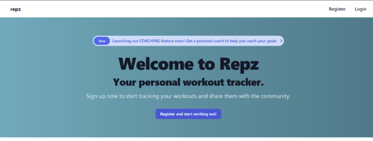
UI Showcase - Before and After
Let’s see our beautiful TailwindCSS transformation in action!
Desktop Homepage
The new homepage features a clean, modern design with proper branding and clear call-to-action:
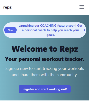
Mobile Responsive Design
Our application now works beautifully on mobile devices with responsive navigation:
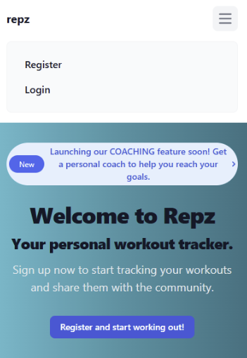
Mobile Navigation Menu
The hamburger menu provides easy access to all features on mobile:
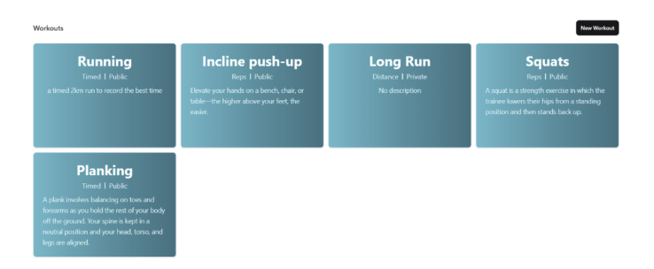
Workouts Grid Layout
The workouts page now displays beautifully with card-based layout:
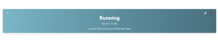
Individual Workout View
Each workout has a clean, focused detail view:
What’s Next?
In future parts of this series, we could explore:
- Adding real-time features with Phoenix LiveView
- Implementing workout tracking and statistics
- Adding social features for shared workouts
- Building a mobile app with React Native
Conclusion
We’ve successfully transformed our Phoenix application with a modern, responsive design using TailwindCSS! Our improvements include:
- Modern Navigation - Clean, responsive header with user dropdown
- Beautiful Cards - Attractive workout display with proper spacing
- Improved Forms - Professional form design with better UX
- Responsive Design - Works great on all device sizes
- Better Typography - Improved readability and visual hierarchy
TailwindCSS has made our application not only more beautiful but also more maintainable. The utility-first approach allows for rapid development while keeping our CSS bundle small and efficient.
Our workout tracking application now has a professional appearance that users will love to interact with!